Hubbards Granola
Updating the Rockstar
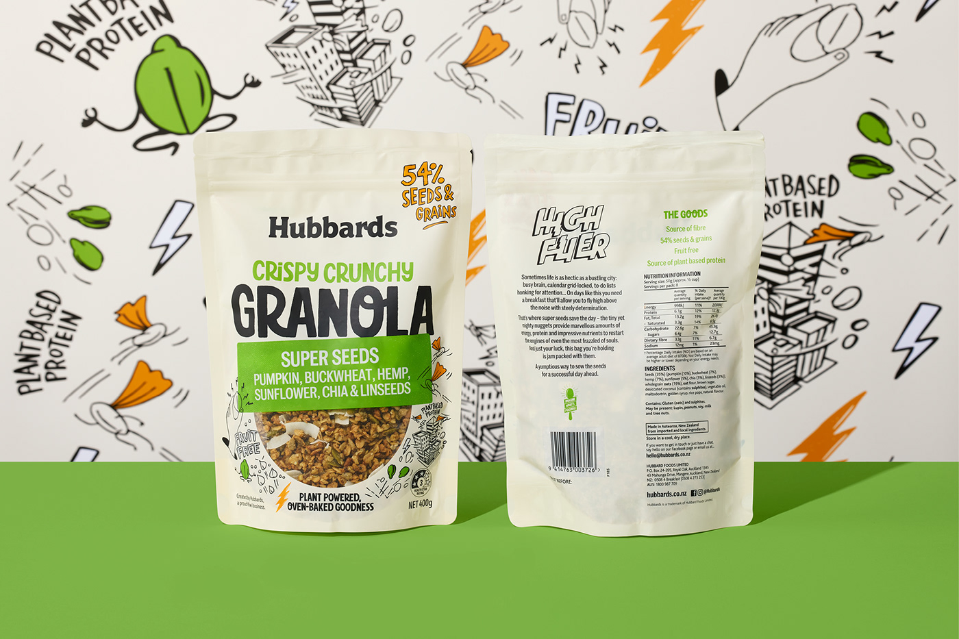
Hubbards Crispy Crunchy Granola is a retail rockstar. The range was responsible for reinvigorating the retail Granola category in 2016 when it was launched and has carried on blazing a trail for others to follow. Onfire was tasked with updating all key visual assets with the new brand toolkit which we had developed, without losing the essence of what made this range so successful.
While retaining the pack hierarchy and recognisable flavour sticker visual assets, the new Hubbards Inventive Sans font shifts the tone-of-voice from restrained foodie to proud creator. The previous abstract ingredient illustrations are replaced with new linear graphics. Integrating with the larger product window, these illustrations are a fanciful expression of the product ingredients and the inventor mindset that is a foundation of the new Hubbard brand. A brighter colour palette and expressive copywriting complete the reinvigoration of the product range personality.
Range of work: Packaging, Branding, Identity
For more about this project visit: https://www.weareonfire.co.nz/design/hubbards-granola-packaging-design/
© All images are copyright of Onfire Design and cannot be used without prior permission.